back
John McGrew was the first layout artist to work with Julian in a personal and extended capacity. In an interview with Michael Barrier towards the end of his life, McGrew stated that Julian “was an excellent watercolor painter; he had a very free, loose style, which was not very appropriate to animated cartoons. It attracted the attention to the background rather than to the action. I had an idea of what backgrounds should be, without knowing exactly how to do it, and I helped Paul get into the right spirit.” Julian in turn expressed that McGrew, whilst helpful, was somewhat prescriptive in his approach to the relationship between layout artist and background painter, recalling that rather than the rough compositional drafts it was more common to receive, McGrew would instead provide detailed colour thumbnails of what he envisioned for each scene. Julian, instead of making these decisions for himself, would then be expected to simply translate McGrew's sketches into fully rendered background paintings.
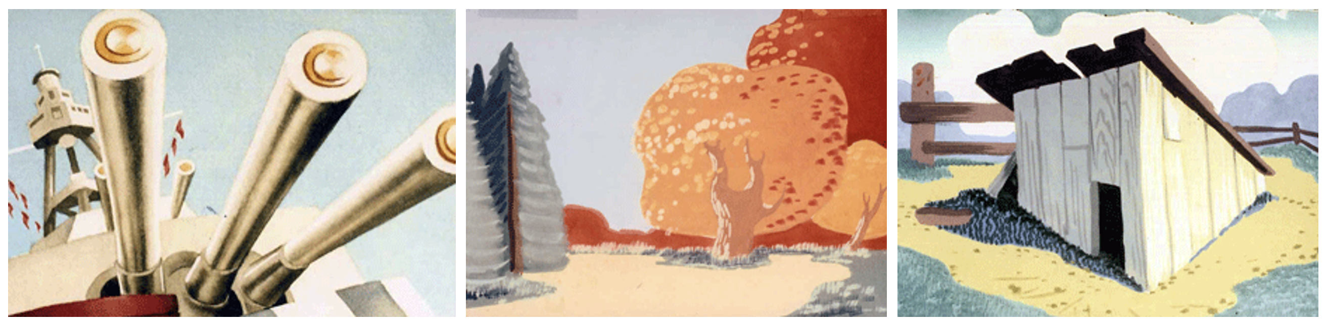
Three examples of John McGrew’s background thumbnails; each roughly 4 3/4 inches by 6 1/3 inches.
From left to right: Conrad the Sailor (1942); My Favourite Duck (1943); Flop Goes the Weasel (1943)
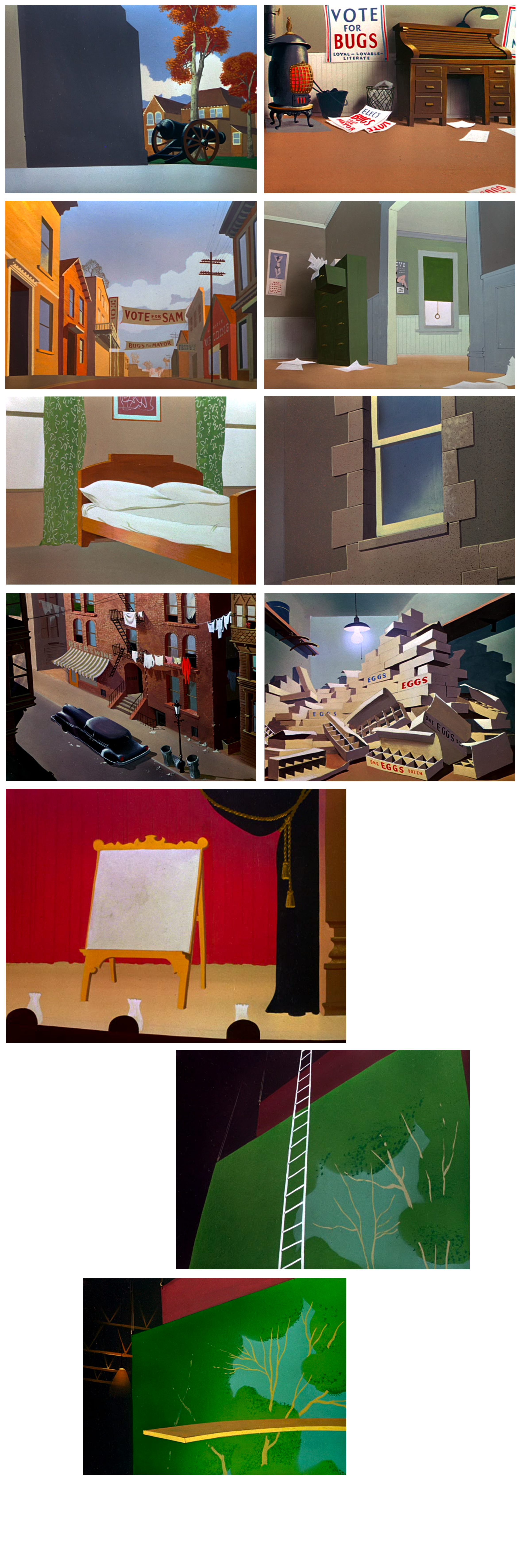
After a couple of years with Warner Brothers Cartoons, from 1939 to roughly 1942, Julian, having been replaced by Gene Fleury as McGrew and Jones' background painter, moved studios and become one of the first wave of employees at the newly established United Productions of America (UPA). Initially a wartime propaganda production house, UPA evolved through the 1940s and 50s to become a bastion for post-war American ‘cartoon modern’ aesthetics. After a stint at UPA – wherein he most notably worked as a designer on director John Hubley’s ‘Brotherhood of Man,’ a union-commissioned informational film promoting racial tolerance – Julian returned in part to Warner Brothers, this time working with Isadore ‘Friz’ Freleng’s unit alongside layout artist Hawley Pratt, from roughly 1946 to 1952. In contrast to McGrew’s tight control over the design of the shorts which Julian worked on, Pratt would instead provide more pared-back directions, outlining arrangements of shapes and more general compositions which Julian was then free, within reason, to paint according to his own colour and texture sensibilities. Already respected as a highly competent artist, Julian would become well known amongst his peers for his specific design choices. Fellow director and animator Bill Hurtz stated of Julian that he had “the most magnificent sense of [color] values of any artist I’ve ever known, except Velázquez,” and that his paintings “make most people’s work seem blunt.”
Julian’s work with Freleng’s unit at Warner Brothers would contribute to the establishment of a distinct and immediately recognisable Looney Tunes visual style: a noticeably warped yet solid kind of worldbuilding which sat somewhere between Disney's pastoral watercolour realism and UPA’s boundary pushing, surface-obsessed modernism. Julian’s realistically rendered shadows and hazy, glowing light sources play off his expertly selected colour palettes; each short he worked on has its own distinct tonal scheme, its own set of textures, and its own specific sense of lived-in charm. Michael Barrier writes that Julian’s backgrounds “were solid and three-dimensional, filled with light and air, but were never overly realistic. They had the same qualities as good Disney animation—they were simultaneously subtle and straightforward, complex in structure but simple in effect.” Towards the end of his time at Warner Brothers, in his most prolific period of background production, Julian was creating somewhere in the range of “45 to 60 paintings (9 to 12 a week) for each cartoon.” His attention to detail and commitment to quality seemingly never faltered.
next